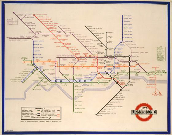
We might not think twice about how to read a map, that’s a good thing and we have Henry C. Beck to thank. The goal of a map should be to convey as much information as simply as possible, following a model of speed, efficiency, and effectiveness. Henry C. Beck understood this, in his groundbreaking London Underground Map he pushed the bounds of modern design and abstraction. His map designed in 1933, scraped a system of trying to mark complex geography and followed a grid system that used straight lines and sharp turns. At the time he was an engineering draftsman for the transportation department and the design wasn’t commissioned, just done in his spare time, maybe sparked by how frustrating the current map system was. The new map was less of a map and more of an information graphic following the Isotype Movement of the time. Beck placed all the stations at an equal distance apart and enlarging the section around the central area of the city. When a test on a trial basis it was met with an extremely positive response from the public. Everyone agreed it was far easier to read and made take the underground much popular because of it. Beck has even been created in helping London’s suburbs grow by skewing the scale of the map he made the commute from the outskirts of the city seem manageable and attractive. Originally for his groundbreaking design that would influence information design for centuries to come, he was paid five guineas– about $8.


Beck’s design still has an immense impact on how we do information design today. While the London Underground has grown since 1933 and many revisions have been made, the basic idea of his design is still used. In fact, it’s used across the globe in transportation design because the goal is still the same– communicate complex information in a simple way. We can see Beck’s influence in the Seattle Link Map, stripped of geography and scale, with equal distance between stops, we can understand an entire system in just a glance. There is power in the design, it actually manipulates how we perceive the information– it makes the airport seem accessible from the city, and the suburbs close to downtown encouraging the use of public transportation for commuters. In 1933, physical maps were vital, now, since the popularization of smartphones, everyone has access to GPS; the future of information design has to keep up with our fast-paced lifestyles and do it in an interesting and captivating way. That’s a big task and different institutions have had varying amount of success. In a recent project by Pentagram, they redesigned the AirTrain in New York. Applying the fundamentals created by Beck, but pushing the limits in a new way– curved lines overlaid on a topographic map. Still following a grid system, but this map engages scale to give a truer sense of distance. Through the use of dotted lines and transparencies, it gives it a digital look we are so familiar with.


For my artifact I created a map of the Art Center under the influence of Beck.

Sources:
Toor, Amar. “Meet Harry Beck, the Genius behind London's Iconic Subway Map.” The Verge, The Verge, 29 Mar. 2013, www.theverge.com/2013/3/29/4160028/harry-beck-designer-of-iconic-london-underground-map.
“AirTrain.” Pentagram, Pentagram, www.pentagram.com/work/airtrain?rel=sector&rel-id=17.